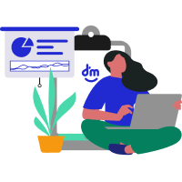
MOBILE DESIGN SYSTEM
Building consistency at scale — Lazuli Design System for DM Bank
Building consistency at scale — Lazuli Design System for DM Bank
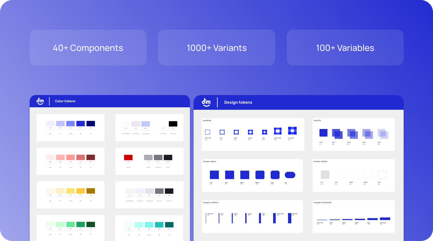
I led the design of the Lazuli mobile design system, a comprehensive and scalable component library built to serve DM's mobile product squads. The system encompasses 40+ carefully crafted components with over 1000 variants, following atomic design methodology to ensure consistency across all mobile applications.
This project established a single source of truth for mobile design, significantly reducing duplicated effort, improving design-to-development handoff times, and ensuring accessibility compliance across all products. The system was documented in Figma and Storybook, making it accessible to both design and development teams.
Role
Senior Product Designer
Duration
October 2024 – August 2025
Websites
Tools
DM's mobile squads were working independently without a shared component library. This led to several critical issues:
The solution was to build a mobile-focused Design System whose MVP delivered design tokens and 15 core components with variants. We analyzed the app's most-used components and ran an audit of current styles, colors, and typography to create a system that fit our existing product while raising quality and delivery speed.
The Lazuli Design System delivered measurable improvements across the entire product workflow — from design consistency and developer handoff speed to team-wide adoption and cross-platform coherence.
Faster Handoff — Reduced design-to-development handoff time through shared tokens, reusable components, and clear documentation.
Fewer Inconsistencies — Dramatic reduction in visual inconsistencies across mobile screens by enforcing a single source of truth for all UI elements.
Team Adoption — Full adoption across design and engineering within the first month — driven by intuitive structure and thorough documentation.
Component Library — 15 core components with multiple variants, sizes, and states — all token-driven and production-ready for mobile.
Design Tokens — Complete token system covering colors, typography, spacing, border radius, and opacity — ensuring pixel-perfect consistency.
Team Workflow — Streamlined collaboration between designers and developers with shared vocabulary, clear specs, and single source of truth.
Documentation — Comprehensive guidelines with anatomy, usage rules, states, and real-world examples for every component in the system.
"The Lazuli Design System has transformed how our teams work together. We're shipping features faster, maintaining visual consistency, and our developers love having a single source of truth for components."
— Design Team Lead, DM Bank
"Since adopting the design system, our sprint velocity increased significantly. Shared components and tokens eliminated most of the back-and-forth between design and engineering — less rework, faster releases, and a codebase that finally matches what's in Figma."
— Tech Lead, DM Bank
Our design system follows atomic design principles, breaking down components into atoms, molecules, organisms, templates, and pages — ensuring consistency and scalability across all products.
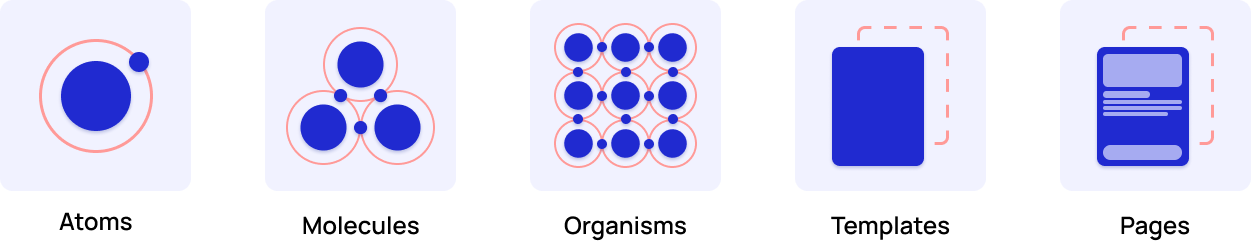
How I applied it at DM (mobile): I mapped existing UI to the atomic hierarchy, tokenized color/typography/spacing, and defined 15 core components with variants. I set clear naming conventions, component APIs, and accessibility rules, then documented usage in Figma (libraries, examples, do/don't). This reduced duplication, sped handoff and QA, and let squads assemble screens faster with consistent behavior across iOS and Android.
Principles are concise, guiding statements that set the intent and guardrails of a Design System. They help teams make consistent decisions, resolve trade-offs, and keep the system aligned with user needs, brand, and product strategy.

Designed with people at the center, prioritizing accessibility and inclusive experiences.
Minimal, focused interfaces that reduce cognitive load and guide users intuitively.

WCAG compliant components ensuring usability for users with diverse abilities.
Clear documentation and open design decisions enabling team collaboration.
A color palette is the set of official colors in a Design System, defined as tokens for consistent use across the interface. It drives brand identity, visual hierarchy (primary, secondary, states), and accessibility (proper contrast). The result: faster decisions, fewer inconsistencies, and cohesive UI.
Typography in a design system ensures visual consistency, readability, and hierarchy across all screens. It defines font families, sizes, weights, and spacing to guide how text is presented — from headings to body copy — creating a cohesive and accessible user experience.
Typeface
Alphabet
Aa Bb Cc Dd Ee Ff Gg Hh Ii Jj Kk Ll Mm
Nn Oo Pp Qq Rr Ss Tt Uu Vv Ww Xx Yy Zz
Numbers & Symbols
0 1 2 3 4 5 6 7 8 9
! @ # $ % & * ( ) ? + =
Type Scale
Heading 1
34 · BoldHeading 2
28 · BoldHeading 3
22 · BoldHeading 4
18 · BoldBody 1
16 · RegularBody 2
14 · RegularCaption
12 · RegularOverline
10 · MediumAa
Light
300
Aa
Regular
400
Aa
Medium
500
Aa
SemiBold
600
Aa
Bold
700
Design tokens are the single source of truth for UI primitives—spacing, margins, borders, border-radius, shadows, and opacity—applied consistently across products. We adopted an 8-point scale for predictable spacing and rhythm, and more rounded corners to reinforce a human, approachable feel while improving tap targets on mobile. Standardized shadows and opacity levels clarify hierarchy and states, reducing ambiguity and speeding delivery.
The grid system provides a consistent spatial framework for laying out components and content. It ensures alignment, proportion, and visual rhythm across all screens and breakpoints.
Mobile Grid — 4 Columns
Grid Specifications
Columns
4
Gutter
8px
Margin
16px
Baseline
4px
Iconography provides a consistent visual language that aids navigation and comprehension. Each icon follows a unified style to ensure clarity and cohesion across every screen and interaction.
Notification
Payment
Registration
Elements
Security
Buttons are the core token-driven components for triggering actions. They follow the design system's color, spacing, and border-radius tokens to ensure consistency across all touch points.
Icon
Optional leading or trailing icon
Label
Action text, verb + noun format
Container
Background fill + border-radius token
Fill
Outline
Ghost
| Button Type | Primary Function | Visual Emphasis |
|---|---|---|
| Fill | Primary actions, key conversions | High — solid background |
| Outline | Secondary actions, alternatives | Medium — border only |
| Ghost | Tertiary actions, navigation | Low — text only |
| Fill | Outline | Ghost | |
|---|---|---|---|
| Default | |||
| Hover | |||
| Small | |||
| X-Small |
Default
Disabled
Loading
Info
Error
Success
Right Icon
Left Icon
Outline + Icon
Ghost + Icon
Input fields allow users to enter and edit text. They follow the design system's spacing, border-radius, and color tokens to ensure a consistent, accessible data-entry experience across all forms and flows.
Label
Visible text above the input field
Container
The outer border + background
Icon
Optional leading/trailing icon
Placeholder
Hint text when input is empty
Helper
Contextual hint or validation message
Text Input
Password
Textarea
| Input Type | Primary Function | Visual Cue |
|---|---|---|
| Text | Single-line text entry, names, emails | Standard border, placeholder |
| Password | Masked sensitive data entry | Obscured characters |
| Textarea | Multi-line text, comments, descriptions | Resizable, taller container |
| Preview | Description | |
|---|---|---|
| Default | Idle state with gray border | |
| Focus | Blue border + ring on focus | |
| Filled | Input with entered value | |
| Disabled | Gray background, no interaction |
Error
Success
Warning
Left Icon
Right Icon
Large
Default
Small
Checkboxes allow users to select one or more options from a set. They follow the design system's color, spacing, and border-radius tokens with clear visual feedback for every interaction state.
Container
Bordered box with rounded corners, 22px default
Checkmark
SVG icon visible on checked/indeterminate state
Label
Descriptive text for the option
Touch Area
Invisible tap target, 44px minimum for mobile
Unchecked
Checked
Indeterminate
| Type | Usage | Visual |
|---|---|---|
| Unchecked | Default idle state, option not selected | Empty bordered box |
| Checked | Option is selected and active | Filled box + checkmark icon |
| Indeterminate | Partial selection in grouped items | Filled box + dash icon |
| Unchecked | Checked | Indeterminate | |
|---|---|---|---|
| Default |
Label
|
Label
|
Label
|
| Hover |
Label
|
Label
|
Label
|
| Disabled |
Label
|
Label
|
Label
|
Error
Success
Conflict
18px
22px
28px
Select your interests
Vertical Group
Notifications
With Select All (Indeterminate)
Radio buttons let users select exactly one option from a set of mutually exclusive choices. They follow the design system's color, spacing, and shape tokens for clear, consistent single-selection patterns.
Outer Ring
Circular border container, 22px default
Inner Dot
Filled circle visible on selected state
Label
Descriptive text for the option
Touch Area
Invisible tap target, 44px minimum
Unselected
Selected
| State | Usage | Visual |
|---|---|---|
| Unselected | Default idle state, option not chosen | Empty circular ring |
| Selected | Active option, single choice per group | Ring + filled inner dot |
| Unselected | Selected | |
|---|---|---|
| Default |
Label
|
Label
|
| Hover |
Label
|
Label
|
| Disabled |
Label
|
Label
|
Error
Success
Conflict
18px
22px
28px
Select a plan
Vertical Group
Payment method
Visa, Mastercard, Amex
Instant transfer
Bank slip, 1-3 business days
Card Selection Group
Toggle switches let users turn a setting on or off immediately. Unlike checkboxes, toggles trigger an instant state change and are ideal for binary preferences like enabling notifications or dark mode.
Track
Background pill, changes color on state
Thumb
Circular handle that slides left/right
Label
Describes the setting being toggled
Touch Area
Invisible tap target, 44px minimum
| Off | On | |
|---|---|---|
| Default |
Label
|
Label
|
| Hover |
Label
|
Label
|
| Disabled |
Label
|
Label
|
Default brand color
Active / enabled state
Caution / danger toggle
40 × 24
48 × 28
56 × 32
Notifications
Receive alerts on your device
Weekly summary to your inbox
Text messages for urgent updates
Settings List
Privacy
Biometric login
Show online status
Share with contacts
Card Style with Icons
A Tag is a compact UI component used to classify, highlight, or filter items — e.g., statuses, categories, keywords, or selections. Designed specifically for mobile interfaces, tags help users quickly scan and understand the state or category of an element within lists, cards, and filters. They support icon + text combinations across multiple semantic color themes optimized for touch interaction.
Container
RequiredPill-shaped background, min-height 26px mobile
Icon
OptionalLeading symbol, 16px default, 14px small
Text
RequiredRubik Medium, 13px tall / 11px small
Tall
Height 34px · Padding 8/16 · Font 13px
Small
Height 26px · Padding 5/12 · Font 11px
| Size | Height | Padding | Font | Icon | Mobile Use |
|---|---|---|---|---|---|
| Tall | 34 px | 8 / 16 px | 13 px | 16 px | Cards, headers, primary indicators |
| Small | 26 px | 5 / 12 px | 11 px | 14 px | Lists, tables, compact layouts |
Usage mode — each color maps to a semantic meaning across the mobile interface.
| Usage | Light | Semi-Light |
|---|---|---|
| Inactive, no action, unknown | Greyscale | Greyscale |
| Updates, information, links | Blue / Main | Blue / Semi |
| Success, recommended, offer | Success | Success |
| Error, block, cancellation | Error | Error |
| Notification, alert, info | Notification | Notification |
| Attention, warning, pending | Warning | Warning |
All color and style combinations — with and without icon.
Grey
Primary
Success
Error
Notification
Warning
Light Fill
Semi-Light Fill
Dark Fill
Outlined
| State | Light | Dark | Outlined | Behavior |
|---|---|---|---|---|
| Default | Label | Label | Label | Resting state, no user interaction |
| Hover / Press | Label | Label | Label | Subtle darken on touch feedback |
| Disabled | Label | Label | Label | 40% opacity, no pointer events |
Touch Target
Minimum 44px touch area even on Small size tags for accessibility compliance on mobile.
Non-Interactive
Tags are read-only by default. They display status or category information without user interaction.
Truncation
Labels exceeding container width are truncated with ellipsis. Max recommended: 2 words.
Wrapping
Multiple tags wrap to the next line with 8px gap. Never scroll horizontally in mobile views.
Filter Bar
Status Labels
Category Tags
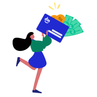
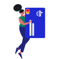
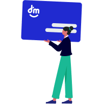
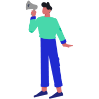
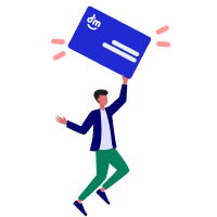
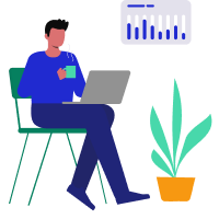
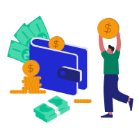
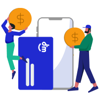
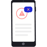
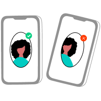
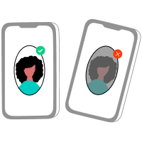
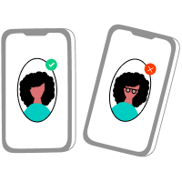
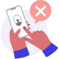
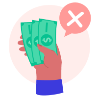
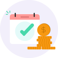
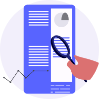
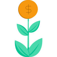
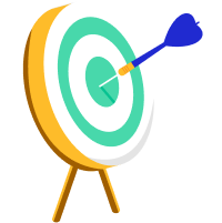
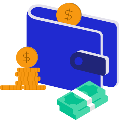
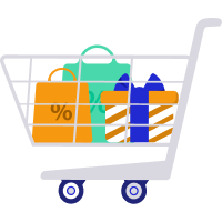
Every illustration was hand-crafted in Figma using only vector shapes and boolean operations — no raster images, no external plugins. This ensures infinite scalability, tiny file sizes, and full editability for any screen density or brand evolution.
87
Unique Illustrations
Covering people, objects, and scenarios across the entire app experience — onboarding, errors, empty states, and celebrations.
100%
Vector-Based
Built entirely with vector paths and boolean operations in Figma — no raster images. Infinitely scalable with crisp rendering at any resolution.
Figma
Designed & Built in Figma
Every character and object was illustrated from scratch using Figma's native vector tools — organized as reusable components with color tokens applied.


The Lazuli Design System is a living, evolving resource that continues to grow and improve with feedback from the design and development teams at DM.