REDESIGNING A CREDIT APP
AS A PRODUCT HUB
Transforming DM's credit application into a unified product experience — without changing the infrastructure
Transforming DM's credit application into a unified product experience — without changing the infrastructure
I led the redesign of DM's credit application, transforming it from a single-purpose tool into a comprehensive product hub. The challenge was to merge multiple disjointed UI/UX flows into a single, intuitive path while working within the constraints of the existing infrastructure.
The redesign prioritized key products, addressed low-conversion flows, and introduced new engagement strategies. By rethinking the information architecture and user journeys, the app became a central destination where users could discover, compare, and access all DM financial products seamlessly.
Role
Senior Product Designer
Duration
6 months
Platform
Web & Mobile App
Websites
Tools
DM's credit application had grown organically over time, resulting in a fragmented user experience. Users struggled to navigate between different product offerings, and critical features were buried within disjointed flows. The business was seeing:
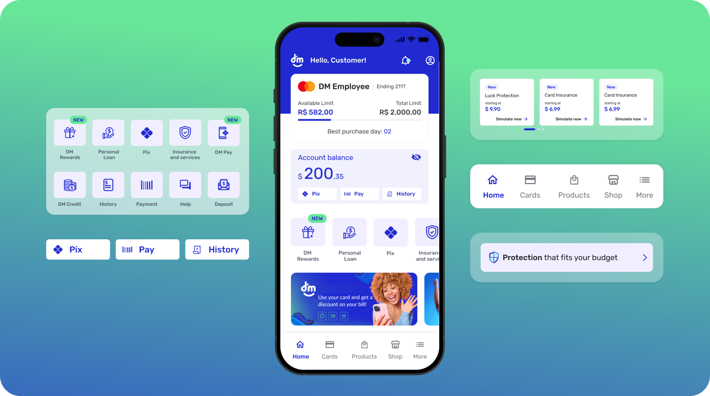
Redesign the Home as the orchestration layer for product discovery and core tasks, establishing a clear information hierarchy that prioritizes essential actions while creating dedicated space for announcements and product highlights. The new model introduces modular sections (hero, quick actions, product shelves, announcements), context-aware prioritization (show only relevant/eligible products), and plain-language microcopy to reduce cognitive load. Visuals and interaction patterns were updated to feel modern, accessible, organized, and simple (high contrast, larger tap targets, scalable type), with lightweight components for performance on older devices—turning the Home into a focused, conversion-ready entry point for a multi-product experience.
800k →
1.3M
users
+62.5%
growth
6 →
11
products
+45%
cross-selling
From a single product to a complete ecosystem
6 / 6 completed
10 / 11 completed
Evolution of the brand narrative in the market
From a single-service provider to a complete financial ecosystem
Integrated solutions that meet multiple needs
Design thinking is a human-centered, iterative method that moves through empathize, define, ideate, prototype, and test — framing the right problem, exploring options, and using rapid experiments and feedback loops to turn insights into practical solutions.
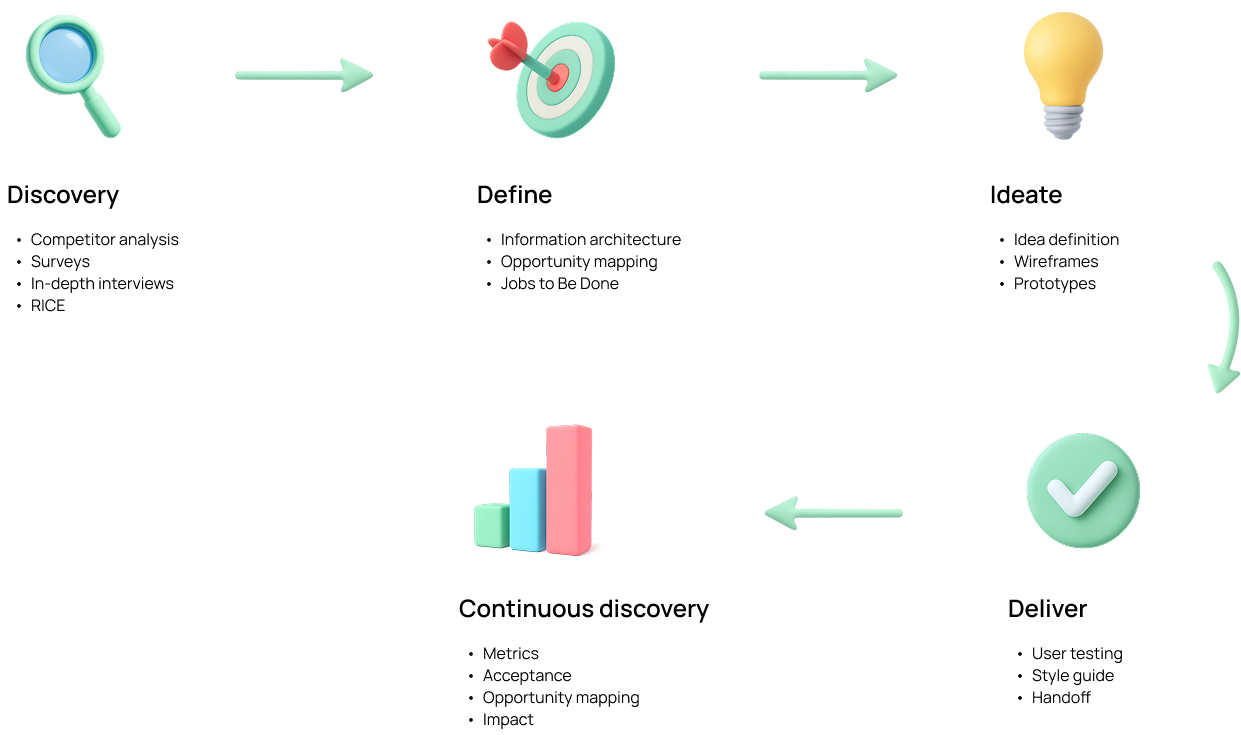
I applied design thinking through a Double Diamond flow with continuous discovery, adapting steps to the product's realities rather than following them rigidly. Discovery: competitor analysis, surveys, and in-depth interviews, then RICE to prioritize. Define: synthesize insights into problem statements, hypotheses, and success metrics. Ideate: explore options, define ideas, wireframe, and prototype to validate value and usability. Delivery: finalize UI, document a style guide, run user testing, and hand off with clear specs. Continuous discovery: track metrics, confirm acceptance, map new opportunities, and quantify impact to feed the next cycle.
A phased approach to transform the Home from a single-product screen into a multi-product hub, balancing quick wins with long-term scalability.
Phase 1
Q1 2024
Phase 2
Q2 2024
Phase 3
Q3–Q4 2024
Phase 4
2025 — Ongoing
Design acted as the connective tissue between business strategy, user needs, and engineering execution — ensuring every decision was grounded in real insights and delivered measurable value.
Strategic Bridge
Bridge between business vision and technical execution
Vision to Reality
Turning ideas into tangible experiences
User-Centered Focus
Constant focus on the user experience
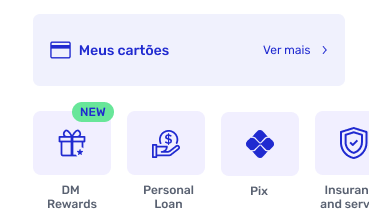
Consolidated multiple entry points into a single, personalized home screen that surfaces relevant products and actions based on user behavior and profile.
Designed contextual product cards that adapt their content and CTAs based on the user's eligibility, usage patterns, and stage in the customer lifecycle.
Reduced navigation complexity by merging related flows and creating clear pathways between products, reducing the average task completion from 8 steps to 4.
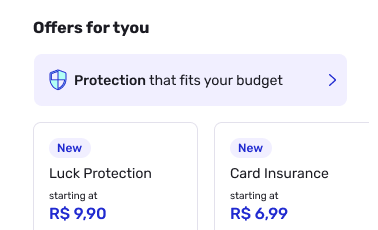
Applied progressive disclosure patterns to present information in layers, allowing users to access details on demand without overwhelming the initial view.
Understanding our users was critical to designing the right product hub experience. These personas were built from real research data — surveys, interviews, and behavioral analytics.
How these personas were built: synthesized from 24 in-depth user interviews, 500+ survey responses, and behavioral analytics data from the existing app. Validated with the product and business teams to ensure alignment with strategic goals.
A comparative analysis of how leading Brazilian financial apps structure their home screens — evaluating navigation, product display, personalization, visual hierarchy, and cross-selling strategies to identify opportunities and set the bar for DM's redesign.
DM's original home scored 1.6 avg — the lowest across all competitors, especially in personalization (1.0) and cross-selling (1.5).
Nubank leads with 4.3 avg across all categories — a consistent benchmark for navigation clarity, personalization depth, and visual design.
DM After scores 4.4 avg — surpassing every competitor including Nubank, with top marks in navigation, product display, and cross-selling.
Before redesigning, we conducted a thorough audit of the existing home screen to map pain points, understand the information architecture, and identify the root causes limiting engagement and retention.
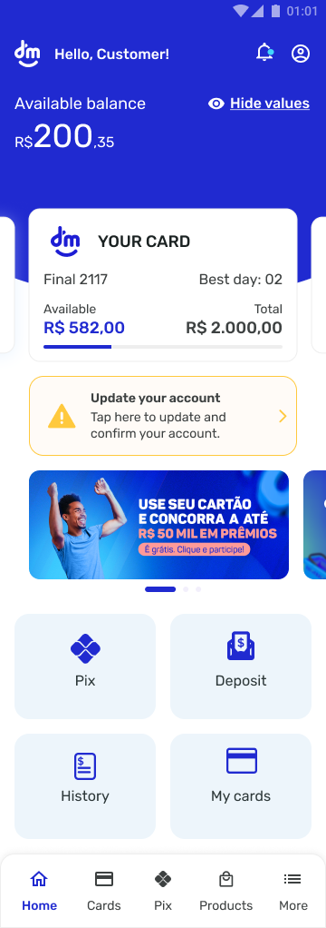
DM App home screen — before redesign
Single-purpose credit interface. The home was designed almost exclusively around the credit product, limiting discoverability of other value propositions and constraining how users could progress beyond the initial offer.
Linear, constrained experience. Navigation relied on a strict, step-by-step path with few alternative routes, shortcuts, or contextual help. Edge/empty states were underexplored, and there was little room for exploration or recovery.
Low user retention. The combination of a one-track journey and minimal reasons to return led to lower repeat sessions, shallow depth of visit, and a short time-to-exit.
Primary items
Secondary items
Tertiary items
Primary (1–4) — most frequently accessed, ensuring efficiency. Secondary (5–6) — support management, secondary to daily ops. Tertiary (7) — enhances experience but not essential for primary navigation.
Information Architecture: Home prioritized a single job-to-be-done (apply/consult credit), underrepresenting adjacent tasks like payments, account health, rewards, and support. Personalization: Little or no tailoring by user segment, intent, or lifecycle stage; CTAs were static and often redundant. Feedback & States: Sparse guidance for error/blank states and limited progressive disclosure, increasing friction and drop-offs. Value Communication: Messaging emphasized product features over ongoing value, weakening reasons to return.
What worked: clear positioning as a credit specialist with a well-established flagship product. Strategy then: continuous refinement of the credit experience and user-base growth. Limitation & risk: dependence on a single product constrained cross-sell and revenue diversification, concentrating risk in one stream.
Why this mattered: a home that behaves like a single-use landing page can convert first-time intent but struggles to activate broader engagement, nurture multi-product adoption, and build durable retention.
A review of leading market apps highlights several areas where the DM App can improve its home screen to position itself as an efficient hub for products and services. Usability and clarity: make the home more intuitive with a cleaner, minimalist design — reduce visual noise and use whitespace to spotlight priority actions so users find what they need quickly. Strategic placement: improve quick access to frequent tasks like payments, transfers, and balance checks via well-placed shortcuts, minimizing taps. Personalization: tailor the experience to user behavior and preferences with personalized recommendations based on usage history.
Digital-service integration: accelerate connections for payments, transfers, and account management, and add high-value services like salary portability, investments, and FGTS birthday withdrawal. User feedback: embed a brief satisfaction survey to capture perceptions and inform continuous improvements. Discreet notifications: refine security and account alerts to inform without interrupting, using subtle, well-placed banners.
Final Recommendations
After implementing the redesigned home screen, we conducted a comprehensive usability test to validate the new experience with real users and measure improvements across key metrics.
Opinion Scale · 140 Responses
"Very friendly app and easy to understand"
— Participant
"Everything is well explained and accessible"
— Participant
"I really found it very simple, easy, and very intuitive"
— Participant
"Clear screen layout and easy to use"
— Participant
"Easy to find the features — simple and straightforward"
— Participant
Opinion Scale · 139 Responses · 1 = confusing, 5 = simple
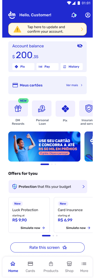
New Home — redesigned experience
"Easy to locate options within the app"
— Participant
"Even the previous app felt smooth, but this one makes it easier by showing the most important tasks on a single screen"
— Participant
"It's very intuitive and easy to find what I'm looking for"
— Participant
"Everything is very clear, with simple wording and well-organized features"
— Participant
"Everything on the home screen is well detailed, simple, and to the point"
— Participant
Opportunity to build a more objective and simple home. Users praised the clarity, but feedback revealed areas to further reduce information density and improve accessibility for less tech-savvy audiences.
"There's no need to show balance values on the main screen"
— Participant
"Very practical navigation, but still too much information"
— Participant
"Needs more clarity in navigation, especially to help less tech-savvy users"
— Participant
Opportunity to retain users by guiding them to specific functionality pages, increasing the possibility of cross-selling other products and services beyond the primary credit offering.
"It's improving, but it could be better — when taking a loan, the installment amount should be visible on screen"
— Participant
"Very easy... the app just needs a few more loan options for customers..."
— Participant
"I'd like to have an installment Pix option"
— Participant
"I wish the card limit could also be used for Pix payments"
— Participant
Core visual foundations extracted from the redesigned experience — ensuring consistency, accessibility, and scalability across the product.
Primary — Headings & Balance
R$ 200,35
Inter / DM Sans · Bold 700–800
Used for monetary values, section headers, and key metrics. High contrast for scanability.
Secondary — Labels & Actions
Pix · Pay · History
Simulate now →
Medium 500–600 · 12–14px
Navigation labels, CTAs, and quick-action buttons. Compact but legible at small sizes.
Body — Descriptions & Offers
Protection that fits your budget
starting at
Regular 400 · 13–14px
Offer descriptions, subtitles, and supporting text. Optimized for readability on mobile.
8px
Base unit
All spacing derives from 8px multiples
16px
Horizontal margin
Left and right safe area on mobile
12px
Border radius
Cards, buttons, and interactive elements
24px
Section gap
Vertical rhythm between content blocks
A constructive rebuttal to the product roadmap — acknowledging its promise while surfacing risks, gaps, and what must be true for it to succeed.
"Integrated multi-product hub + personalized UX = retention and cross-sell" is compelling, but it's not automatic. Without crisp focus, governance, and proof of value per journey, a hub can dilute clarity, increase cognitive load, and stall adoption.
Revenue Diversification
Diversifies revenue beyond a single credit line, reducing dependency and increasing resilience.
Lifecycle Personalization
Creates room for lifecycle personalization and repeat use — turning transactions into habits.
Brand Positioning
Positions the brand as a broader financial partner, not just a credit provider.
Information Architecture
Home must declare a primary path (most valuable job), then progressive disclosure for the rest. Don't flatten the hierarchy.
State Management
Clear empty/error/blocked states for each product module; show "why not available" to build trust and reduce confusion.
Consent & Transparency
Explain "why you're seeing this," allow control over recommendations. Personalization without transparency erodes trust.
Journey Ownership
Name a DRI per journey (not per product) to prevent fragmentation. Ownership at the experience level, not the feature level.
Design System
Expand tokens/components for modular cards, eligibility badges, and disclosure patterns. The system must scale with the product surface.
The 2025 vision is directionally right, but "hub + personalization" is a means, not the outcome. Anchor on a few high-value journeys, prove cross-sell causality, and scale with operational discipline. Otherwise, the hub risks becoming a busy storefront that underperforms the old single-focus experience.
This project demonstrated that transformative user experiences don't always require rebuilding from scratch. By deeply understanding user needs and working within constraints, we turned a simple credit app into a powerful product hub that drives engagement and business growth.